Challenges

  1. Brand Legitimacy: The online reviews had people wondering if Wisp was a real company.

  2. User-Centric Design: Designing an accessible and relatable brand that caters to folks struggling with finding the sexual medical care they deserve.

  3. Scalability: Ensuring the website and brand can handle a growing user base and future updates without compromising performance.

Process

I was brought on as the founding designer to brand Wisp internally. My process began with research—speaking to patients, reading reviews, and analyzing competitors to understand where we could set ourselves apart. I then built a small creative team, including both internal designers and external partners, to bring the vision to life.


Key actions during the process included:

  • Establishing Wisp’s brand story, positioning, and vision.

  • Crafting mission and vision statements, as well as copy for taglines and campaigns.

  • Conducting extensive competitor and customer research to shape the brand direction.

Solution

I led key initiatives to address Wisp’s challenges:

  • Brand Identity: Developed new logo, color palette, and visual direction.

  • Design System: Built a mobile-first system, improving the site experience.

  • Conversions: Revamped product page, increasing conversions.

  • Artist Program: Launched a partnership with underrepresented illustrators.

  • Email Campaigns: Directed 13 new flows, boosting engagement.

  • Product Launches: Led creative for six launches, enhancing packaging and messaging.

  • Photography: Directed shoots, producing proprietary cross-channel images.

FAQ

Challenges

Process

Solution

Results

Challenges

Process

Solution

Results

Harlow Hotel

Brand Strategy

Brand Identity

Visual Design

Web Design

The Opportuity

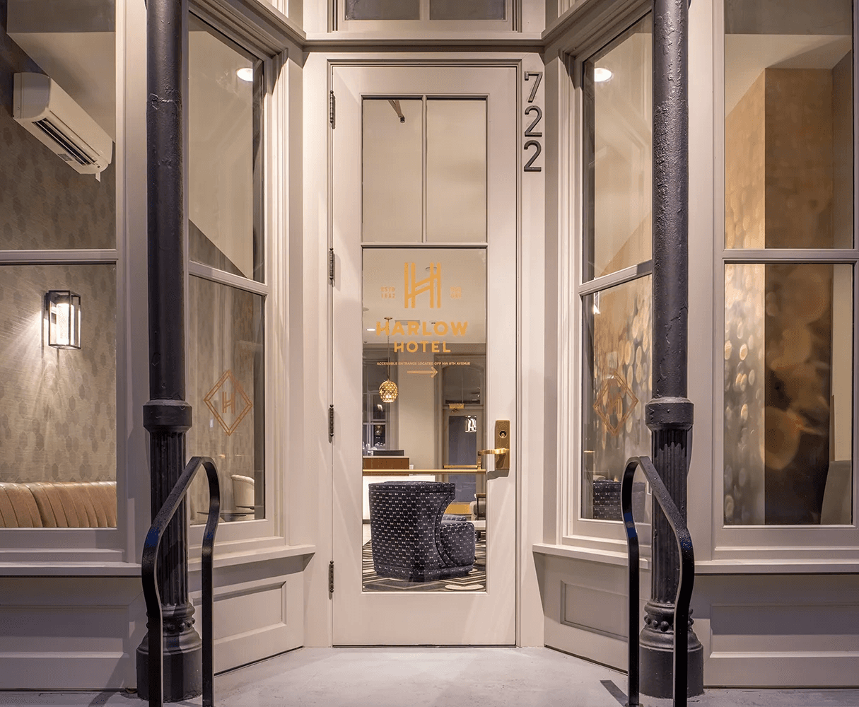
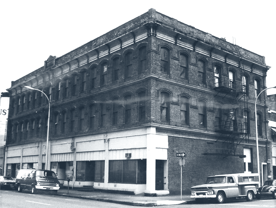
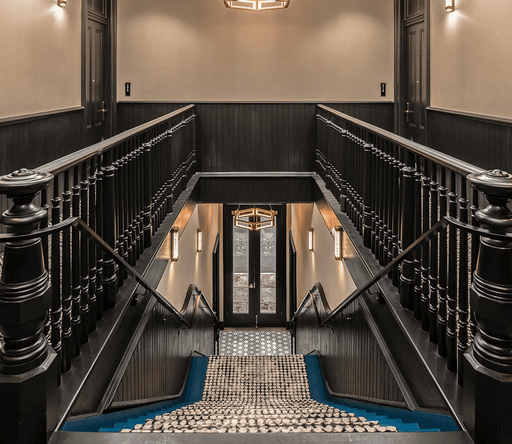
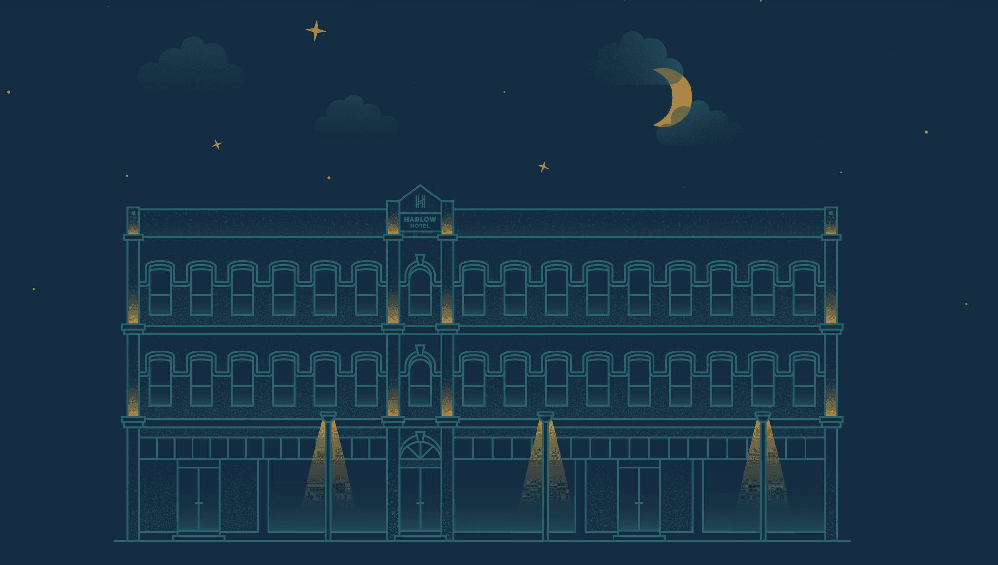
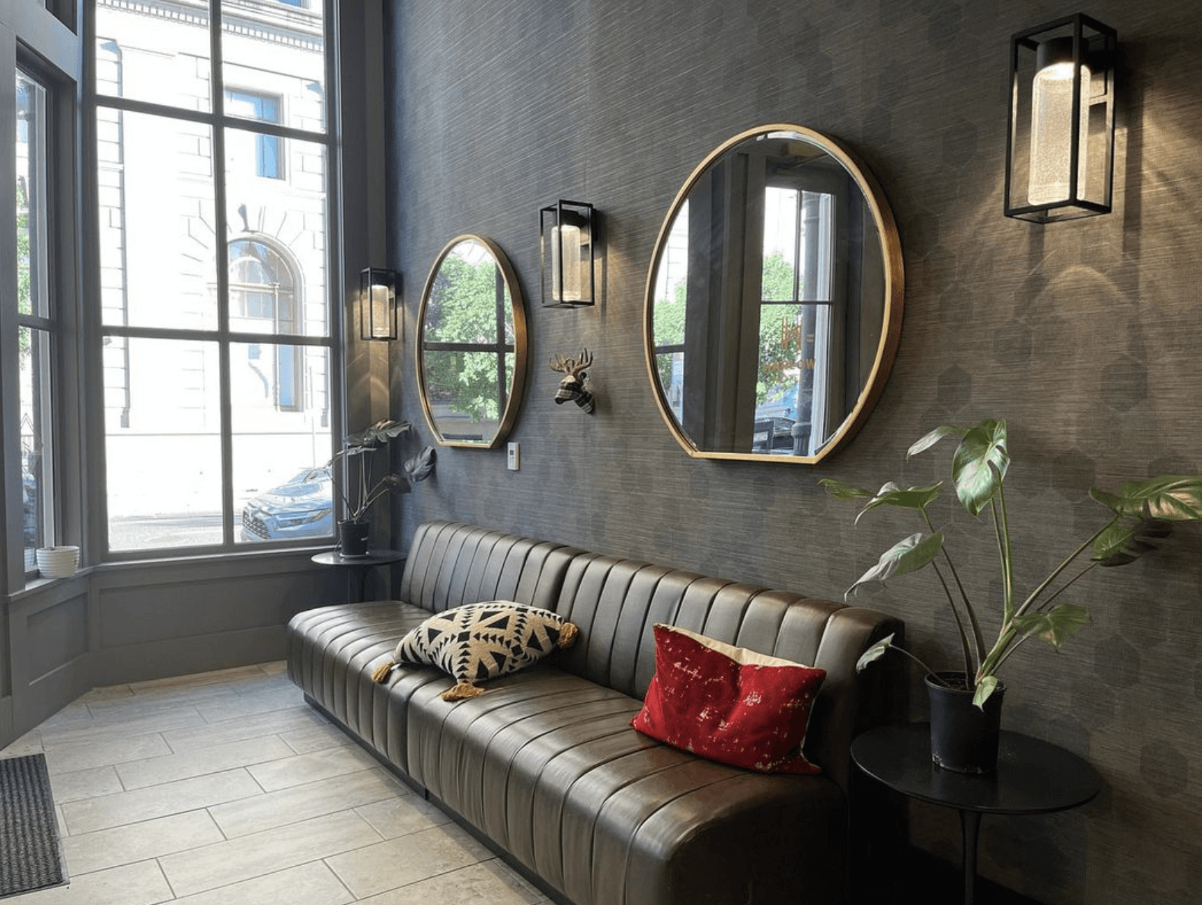
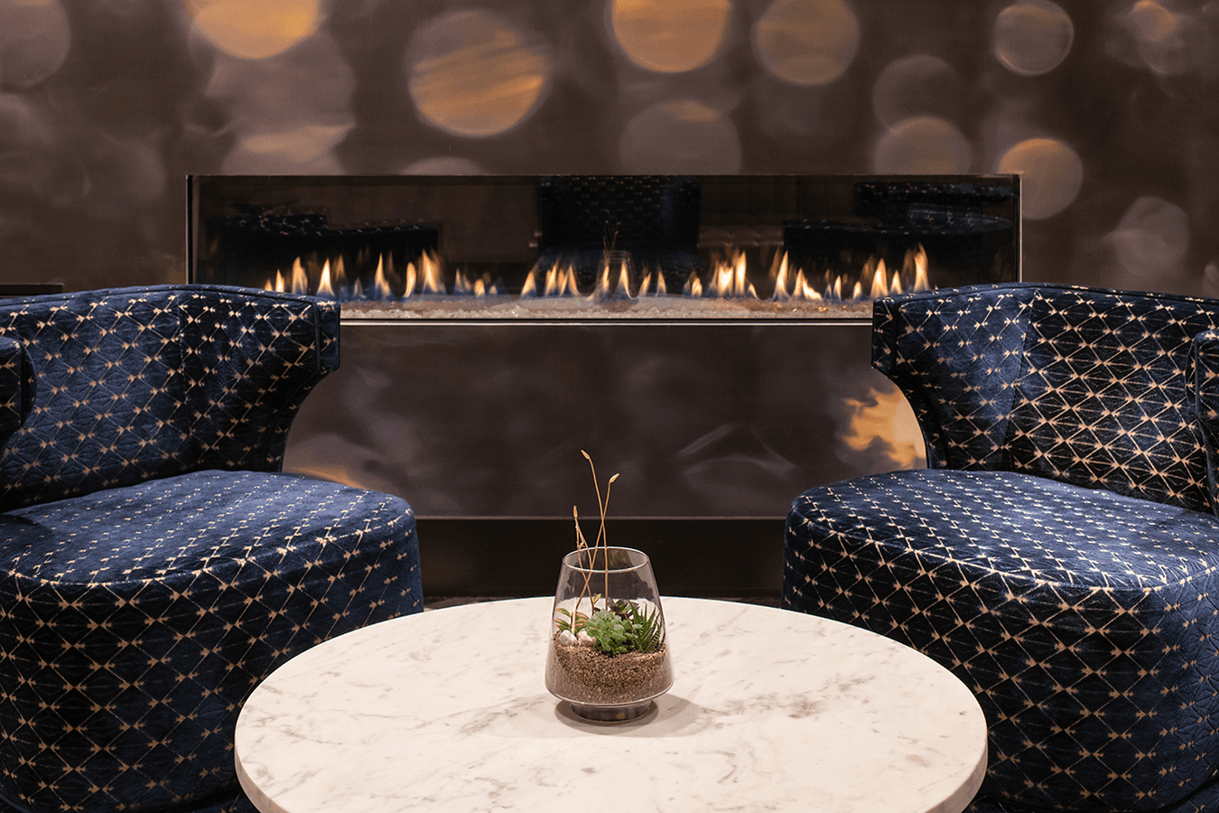
The newly restored historic Harlow Hotel is a boutique hotel built in 1882, that re-opened in 2019 in downtown Portland, Oregon. Nestled on the east side of Portland's north park blocks, Harlow is right in the center of it all - walking distance to many of downtown's finest galleries, restaurants, and museums. 

Role

Creative Director, Designer

Industry

Hospitality

Challenges

Process

Solution

Results

Challenges

Process

Solution

Results

Challenges

Process

Solution

Results

Challenges

Process

Solution

Results

The Mark

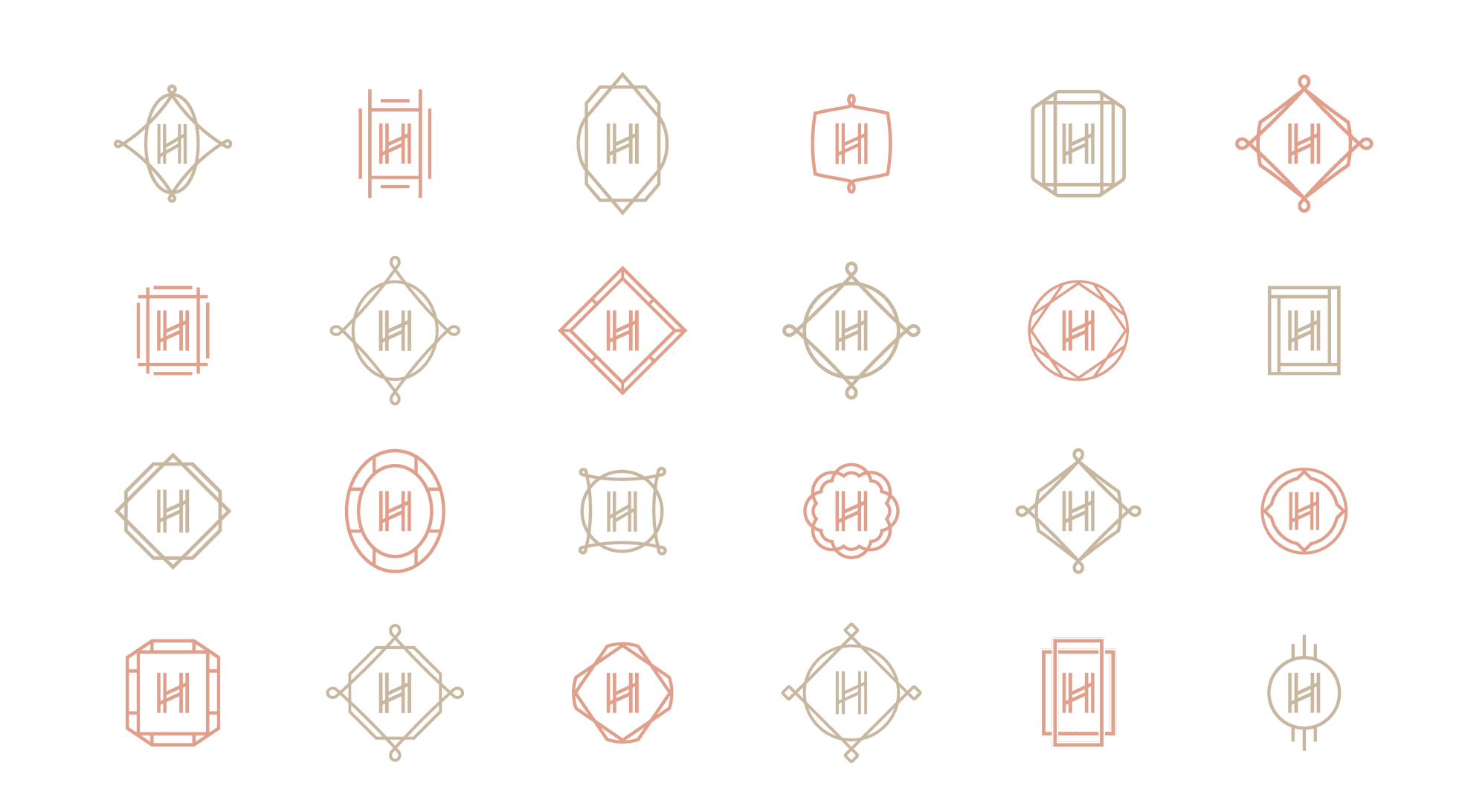
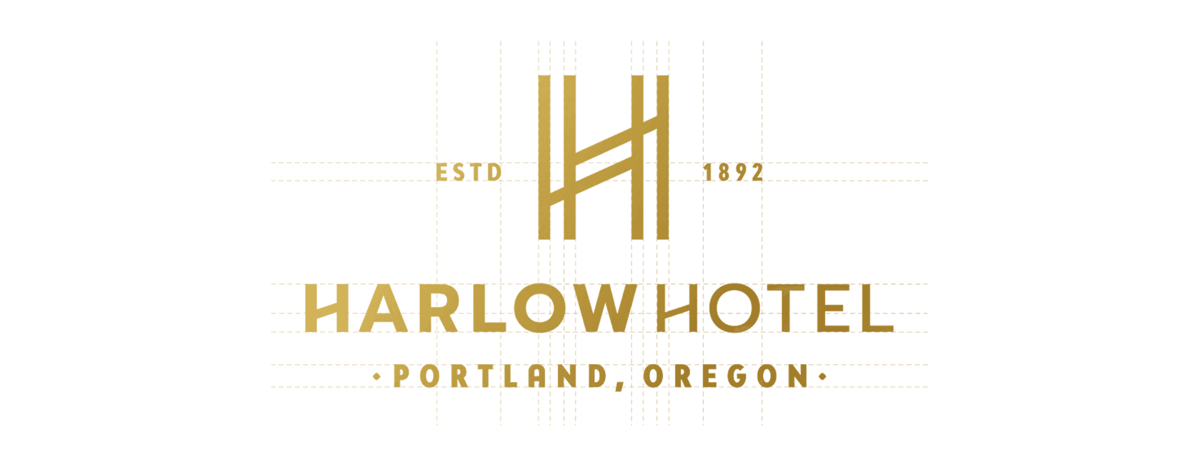
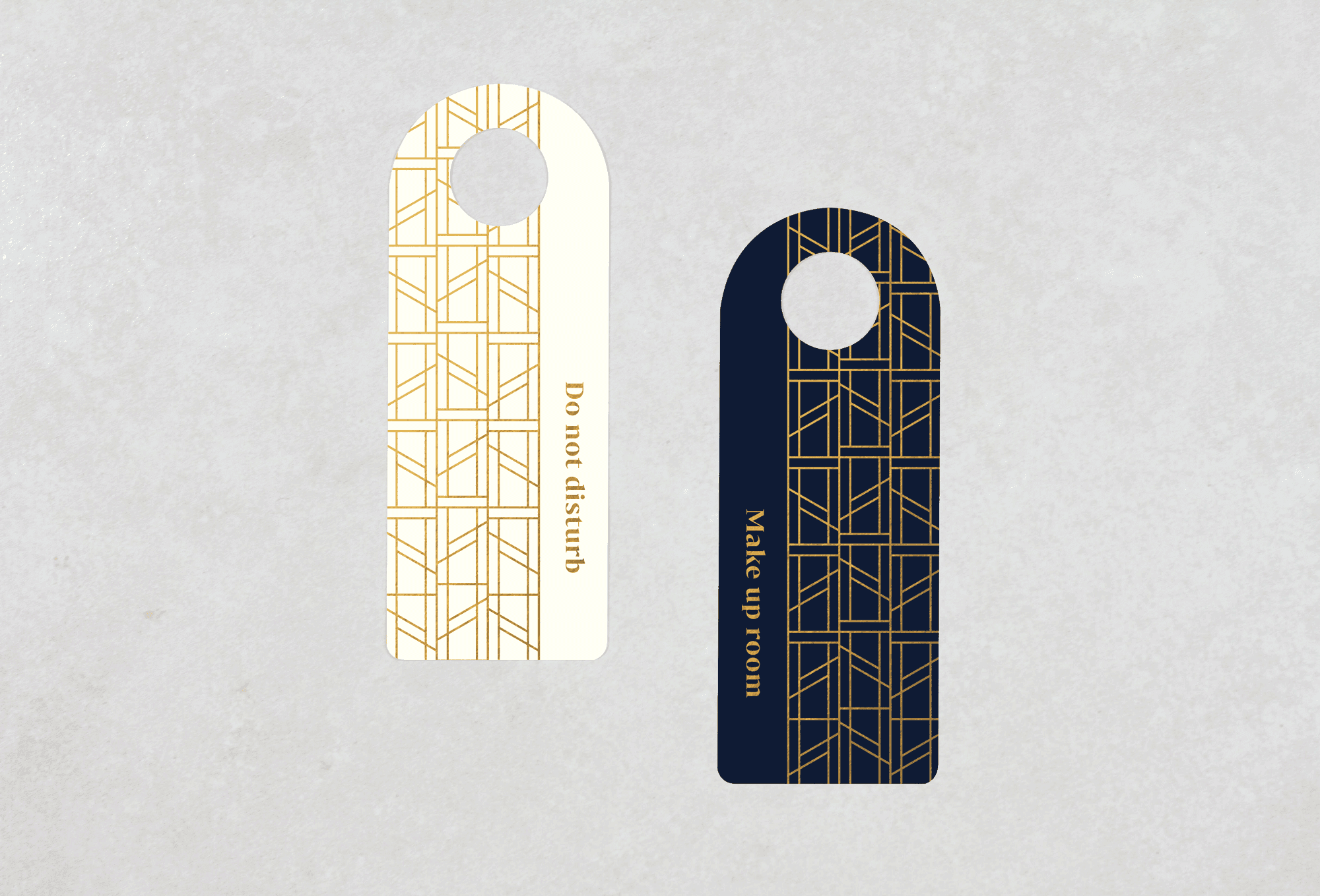
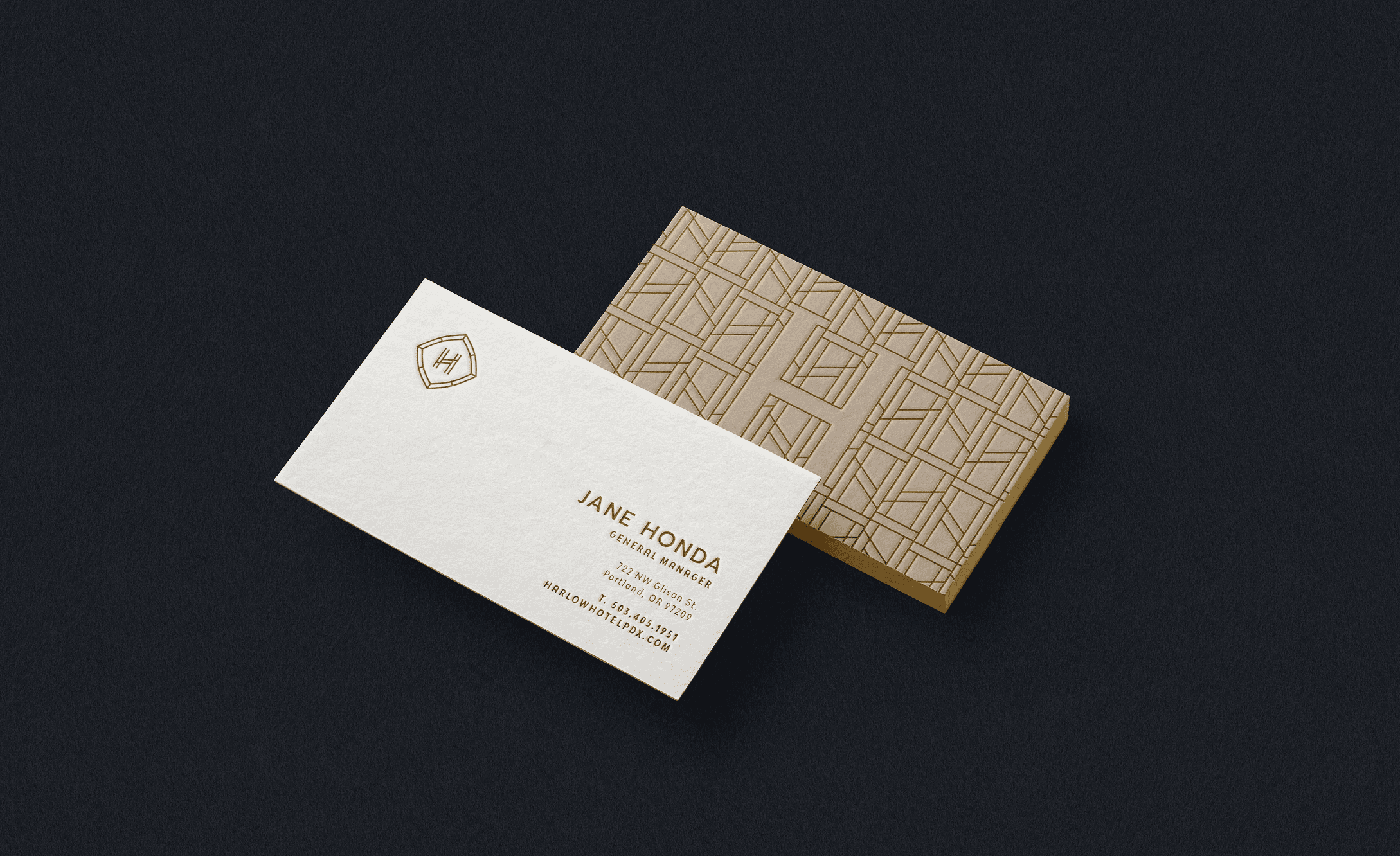
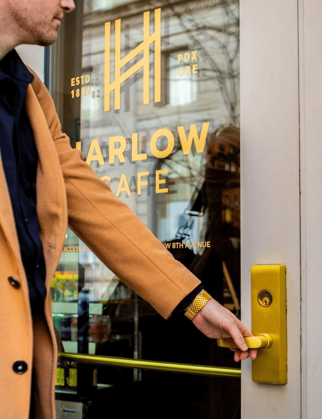
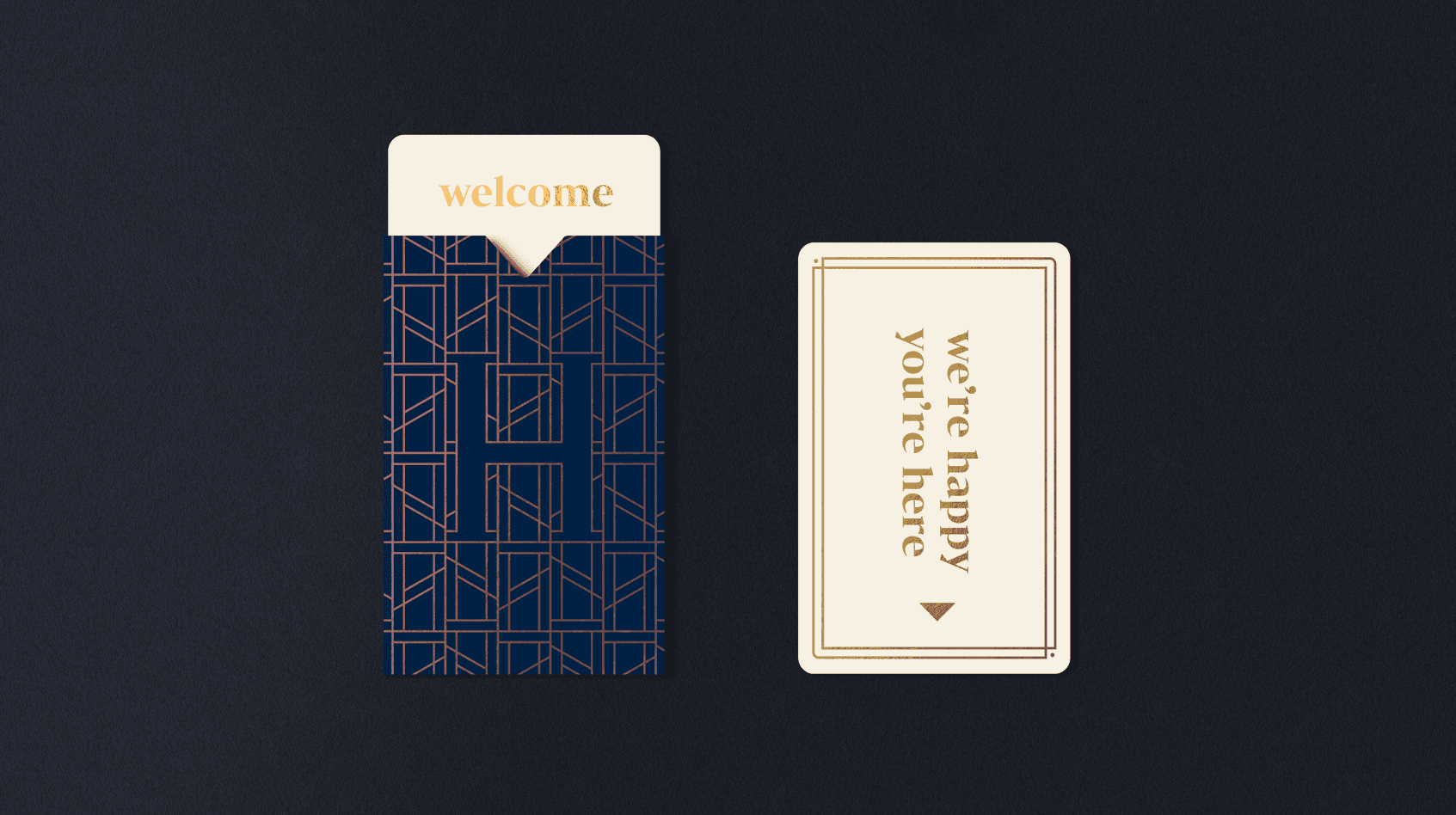
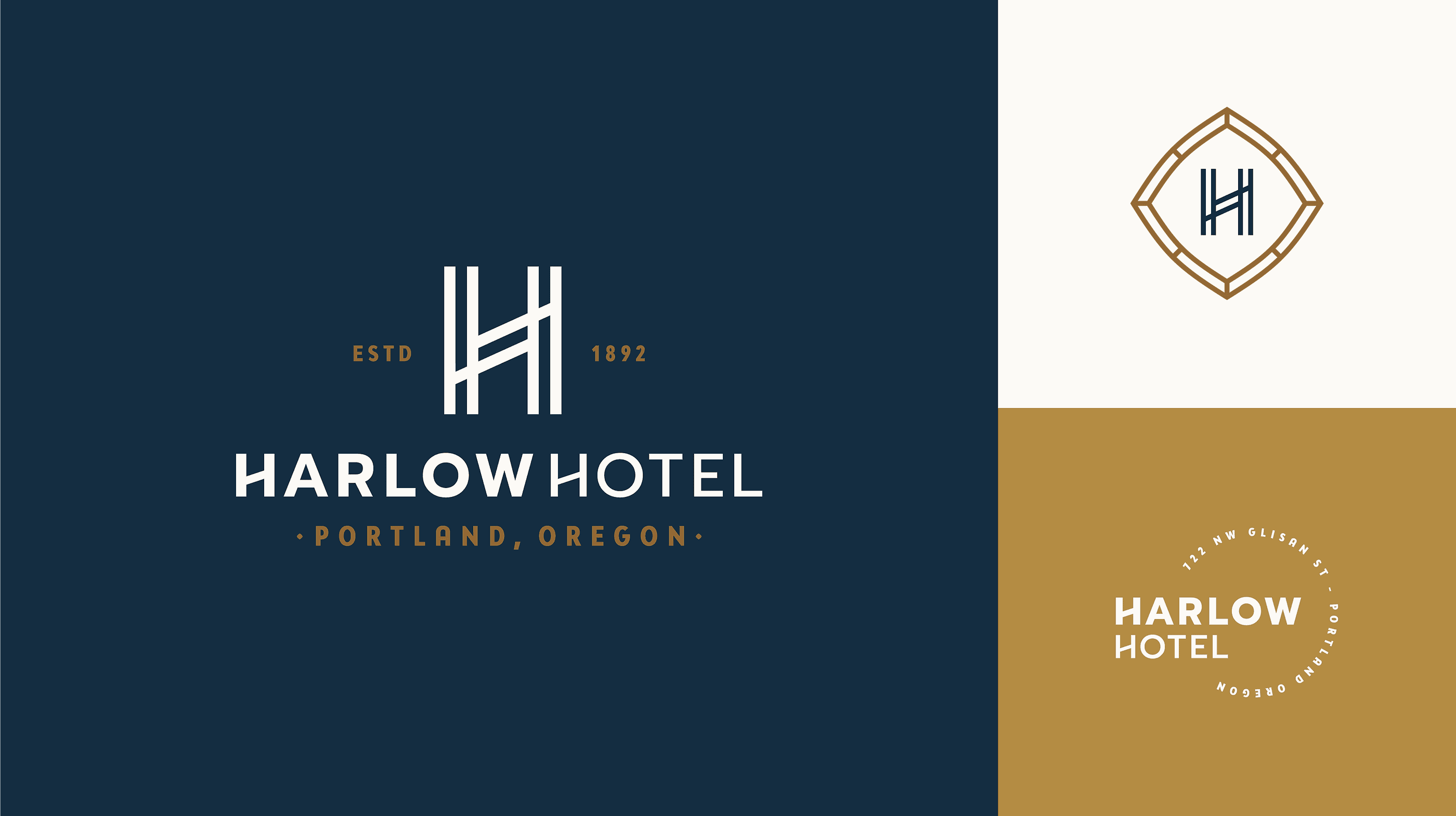
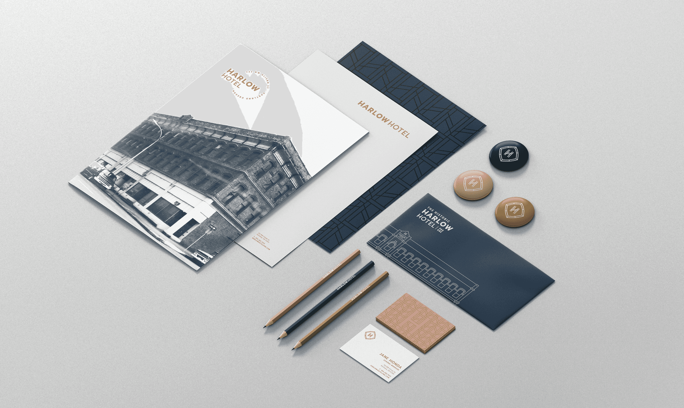
The main mark was inspired by the famous stained glass windows of the era. I designed the double crossbar seen in the H to emphasize the double h's found in the name Harlow Hotel while speaking to the time period while aligning the stroke width stylistically with the shape of the mark and enclosure weight. The room number typography was custom, too.

Website

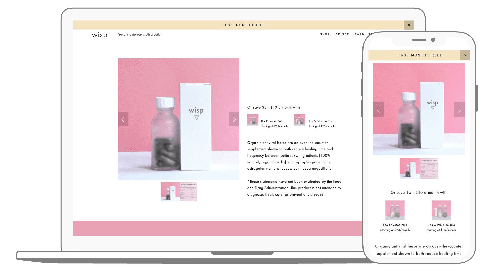
Before and after product page including new photography assets (featuring the rebranded labels), simplified grid system, overhauled messaging, styling, upgraded functionality, and a re-envisioned checkout experience.

Credits

Creative Director, Designer: Shallin Mayher

Marketing Partner: CoHo Services
More Projects

More Projects

More Projects

More Projects

I'm excited to meet you

In the meantime, follow me and check out some amazing musicians I think you'll love

Created by

shallin mayher [shal-lyn]

shallin mayher [shal-lyn]

I'm excited to meet you

In the meantime, follow me and check out some amazing musicians I think you'll love

Created by

shallin mayher [shal-lyn]

I'm excited to meet you

In the meantime, follow me and check out some amazing musicians I think you'll love

Created by

shallin mayher [shal-lyn]

shallin mayher [shal-lyn]

I'm excited to meet you

In the meantime, follow me and/or enjoy some fantastic musicians I think the world should know.

Created by

shallin mayher [shal-lyn]

shallin mayher [shal-lyn]

I'm excited to meet you

In the meantime, follow me and/or enjoy some fantastic musicians I think the world should know.

Created by

shallin mayher [shal-lyn]

shallin mayher [shal-lyn]